Today, the art of creating and selling templates exists at the intersection of creativity and commerce. As the demand for customizable solutions continues to soar, the template market has evolved into a dynamic ecosystem where creators can thrive by offering solutions that cater to diverse needs. So, why not take a chance?
Let this be your guide to turning your passion for design into a rewarding venture, where each template you create is not just a piece of art but also a valuable asset in a thriving marketplace.
How to create high-quality templates in xTiles?
Many applications and software offer their own templates. For example, you probably have heard about Microsoft Word templates, custom Office templates, or Excel templates, even if you haven’t used them yourself. What we’re going to suggest to you is much easier and more attractive, even if the word “template” is a bit foggy for you right now.
xTiles is glad to offer you a place to submit your art for selling and guidelines on how to get maximum profit from your templates. We know that the creative process isn’t an easy one. However, it doesn’t have to be complicated, devastating, and lead to burnout.
Knowing how to create templates is much more than knowing which buttons to press to get a ready-to-use document. There are many pitfalls a creator should be aware of to successfully reach out to their target audience. However, in this blog post, we’re going to go over all of them, so a blank document will shortly and easily turn into your very own template that can bring revenue.
For many, selling their own templates isn’t easy, especially if they created them only for themselves in the first place. That’s why it’s recommended to start with documents you deliberately designed for business purposes.
Where to start when creating your own template for selling?
The journey starts with you. What is it that you know the best? How to plan your week from A to Z without missing the tiniest of your tasks? How to write an essay that will make people cry over it? How to brainstorm new ideas that will change the world? That should be your starting point for creating a desired template.
However, your skills aren’t the only thing that decides when you want to create a template that generates income. You need to understand what it is that people need and want at the moment. The market demand and the audience’s preferences are important factors too.
Please note that it won’t be static. For example, when a new year starts, people will rush to templates that will help them stick to their resolutions. When the year ends, people will need something to plan their presents and holidays. Use it as an insight.
If you’re all about proofs, you can also search on other platforms where people sell their templates, like Etsy or Gumroad.
Combine the information you get with your own preferences and spheres of expertise to decide on a custom template you’re going to create.
You probably know your audience back and forth if you’re a seasoned template creator. So, these research sessions will become shorter and shorter over time.
You can create a list of templates with potential on the market. Save the list for future use and extend it every time you get an idea stumbling upon something useful on the internet, like your competitors’ templates. At some point, this list of suggestions may become your business plan.
Your target audience also decides on what language you’re going to use in your template. You’re not limited to English only. You’re free to use your native language to make this template even more useful and easier to understand. However, if you want to reach a wide audience, it’s preferable to use English. After all, people can use the language they want to insert their data. Or they can even change the names on your blocks if they want to.
Creating templates with the latest cultural trends is an easy way to satisfy the audience’s request. Surely, its popularity likely won’t last long, but you don’t have to make them too elaborate. Also, it’s a good idea to add elements of popular trends to your existing templates and try to sell them like a special edition. This way, you don’t have to create anything from scratch. You just work with what you already have.
What to consider to get your template published
Now that your audience is satisfied with your new template, let’s think about the xTiles team. As you dive into the world of creating and sharing templates, let’s have a quick chat about some key things to make sure your template hits the right notes.
So, if you want to get your template published, take them into account.
- A great template is designed to solve real problems or meet specific needs. Think of it as your go-to sidekick, crafted with a particular audience in mind and ready to provide a clear and practical solution. Will that template of yours help people with what you created it for? That’s why it’s important to test your templates for a few days at least to ensure they work.
- You can test your templates either yourself or ask your friends to do it for you. The second option is even better because then your creation will meet someone who has no clue about how it works and what it’s supposed to do.
- An effective template breaks free from the ordinary and adds a dash of creativity. Picture it as a canvas where you can mix and match layouts and styles, creating something that really stands out. In other words, basic is good, but it will be much better with a pinch of creativity.
- Also, blindly copying from others who are successful isn’t the option that will help to win the audience. It’s better to have fewer ideas, but unique ones, that answer questions and requests no one has ever answered before.
- Note that if your template is destined for greatness, it needs to grow with the flow. Check how it handles extra content over time.
- When the template stops working correctly after a serious amount of information was put in there, there is a huge chance the person will search for another one, and probably it won’t be yours.
- Your template should be a joy to use – no offensive content, impeccable spelling, and a layout that just makes sense. After all, the better the experience, the happier the user!
Designing your xTiles template in a few easy steps
This part might seem the hardest one. Indeed, it would be so if you decided on something other than xTiles. Intuitive interface, easy functionality, a long list of opportunities, and a drag-and-drop feature diminish all potential issues in this sphere.
Also, you won’t need to worry about details like how to make your template responsive for different screen sizes and devices. It’s all settled for you.
Now, we also have for you a compelling guide on how to create a visually appealing and user-friendly template. Let’s start with some basic tips.
Creating templates that can win people’s hearts involves a combination of design principles, usability considerations, and attention to detail
1) Match your target audience’s needs with your design choices
Many of your design choices will depend on your target audience. You need to give them what they are looking for. However, you need to understand that being very specific means you shorten the list of your potential customers, which might be pretty inconvenient if you’re only starting your template business.
Clean and simple designs can speak to a broader audience. That’s why it’s recommended to keep your templates conventionally understandable. Also, you may offer versions of your popular templates with specific designs. For example, a folder of your weekly planners designed for every season or important time of the year like New Year, Christmas, Valentine’s Day, etc., may be a great offer.
2) For whom are you creating templates?
It’s also important to decide whether your template is for single use or if users can apply it to multiple projects, or perhaps teams or groups of people can use it at the same time. This feature will affect many elements of your template and also the final price, as multiple-use templates often warrant higher prices.
3) Consistency is your best friend
Consistency is another secret to a great design. It helps create a cohesive and professional look. It’s important to maintain consistency in colors, fonts, and layout throughout the template. Otherwise, you risk putting your customers into chaos where they wouldn’t be able to reach the goal they bought your template for.
4) Hierarchy is a good friend too
The next rule is to establish a clear visual hierarchy by using size, color, and placement to prioritize information. Always remember that important elements should stand out while less critical elements can be more subtle.
5) Make sure your template works when people use it
Ensure your template is responsive and can be easily adapted for various use cases or expanded functionalities. Design your template to be scalable, accommodating additional content without compromising its structure.
Those are the general rules for creating great designs. However, we believe that guidelines should be a bit more detailed to provide novice template designers with a better understanding of what products they can get in xTiles.
Secrets to xTiles templates creating
Below, we’re going to discuss tips for xTiles template creators that are built on xTiles features and special opportunities. Together with the general design rules for templates we discussed above, they will become a solid foundation for creating your first templates in xTiles for selling.
1) Think of your template structure
Your template structure has to be easy to understand. For example, if you want to create a weekly planner, the block with days has to be in one style and be easily distinguishable among other elements on the page.
2) Learn from other creators
It’s an intelligent decision to start creating by looking for references on Pinterest, for example. It will help you ensure that your template structure is unified and will suit many customers. Also, it’s a great way to find new ideas for your templates when everything seems too boring and uninteresting.
3) Maintaine color balance within your template elements
If some tiles on your template will have a lot of text, it’s preferable not to choose too dark or bright colors. Otherwise, the text might be hard to read.
4) Map out the template’s structure for users
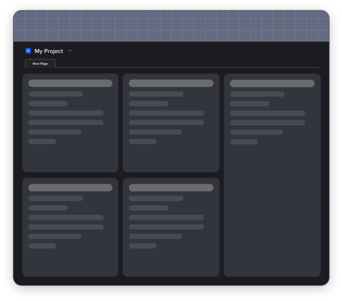
Make placeholders for pictures and texts. It’s easier than ever, just use the drop-down list when you click the right button in the needed place.
5) Use space wisely
Don’t make gaps between tiles – you can lose space. Also, it’s recommended to make the gaps of the same space between all the tiles in your template. It will help to create a polished and professional appearance, unless you want to annoy perfectionists.
6) Symmetry & balance
Make your tiles symmetric to ensure the whole template has a neat and attractive appearance. If the customers need them in other sizes, they can change that on their own.
7) Avoid cluttering
Don’t make tiles too small and put too many of them on one page. When a user starts to use a template with such a structure, there’s a huge chance that everything will go astray. The template has to maintain its structure after a person starts using it.
8) Release your creativity
Don’t be afraid of colors. Yes, surely clean and simple designs are great, but it’s the accents that make a difference and attract people. You can use colors for tabs to make your templates more visually appealing.
9) Cherry on top
The cover is usually the first thing people see when they open your template. Naturally, it has to be attractive, but not silly. It has to be relevant. Choose something people won’t get tired of seeing every day.
You can find more covers for your templates at https://unsplash.com/ and https://www.pexels.com/.
Create a template with xTiles step-by-step
Creating an xTiles template is a rewarding process that allows you to tailor solutions to specific needs. You can design templates that not only look visually appealing but also provide a seamless and efficient user experience. So, now that we know the theory, the practice will be a piece of cake.
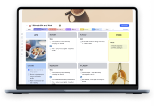
Let’s create a template that can suit anyone, whether it’s a doctor, teacher, or a free-spirit artist who doesn’t quite like planning something – a weekly planner
What should you do first to create your own template?
1) Create a new document
Click the “create a new project” button in the top right corner of your Personal projects in the main menu. Your new document needs a name. The file name will be important later when you’re submitting your template to our support team, so let it be something representative.
2) Plan your template
Map out the essential components and sections needed for your template. Consider the logical flow of information and organize blocks accordingly. When building blocks in your template, be mindful of the balance and design principles we discussed earlier.
Some people prefer working on their template plan somewhere else at first. Many would use a word document to shape their idea, and only then will start to create and design. However, you don’t have to use a different location for your planning as xTiles is perfectly suitable for outlining whatever you want to create.
Don’t worry if something goes wrong once you start adding elements; you can always delete what is excessive.
Your template can be one-page or multiple pages big, depending on how complicated and multi-leveled the document you want to create. It’s possible to create easy navigation between pages using backlinks and collections.
Sometimes, a basic template, like a weekly planner, can be conveniently extended thanks to different elements that usually aren’t part of this kind of template. Yet, you give potential clients the ability to save money and space by having one template that allows them to plan and control different aspects of their lives. For example, you can add a fitness or meal tracker to your week planner or a book tracker if you’re targeted at book lovers.
3) Start creating the needed elements
Create 7 similar tiles for each day of the week. Choose a consistent style, color palette, and size for your template blocks. Place them in a way that a person can easily navigate between them. Ensure that each tile serves a distinct purpose and is easily distinguishable.
If you want your template to have additional sections, just use the “+” button near the current page and start adding whenever you think is relevant.
4) Stick to the rational design principles and think about usability
Check the contrast between text and background colors to enhance readability. We don’t need people to put extra effort into understanding what they have written.
5) Benefit from xTiles featurs
Leverage xTiles’ interactive features by adding widgets, links, tables, pictures, and checkboxes. Implement elements that enhance user engagement, such as task completion checkboxes. You may also add different widgets, like the Spotify widget, to make this template more comfortable for continuous use.
6) Take care of guidelines for potential users
Include concise and clear instructions within the template itself. You can add these guidelines to the respective blocks and tiles. Many creators believe that basic templates like progress trackers or weekly planners need no explanations because everyone knows what to do with them, while in reality, people often get lost, especially when it’s their first template. Explain the purpose of each section and any interactive features.
Your guidelines can be your placeholder text that will showcase how your template looks once it is used.
7) Choose the cover that resonates with your template’s purpose
This step can be either the first one or the last one – add a cover. The recommended size is 1374×164. This is entirely up to you, your taste, or your sense of humor. However, the rule about simplicity and unified elements works here, too. It’s great to find your one and only customer, but your success depends on how well your templates sell, so try to reach out to a broader audience if that is possible; don’t limit yourself.
8) Revise & edit
Before you’re ready to present your creation to the world, it’s important to test available templates and edit them. Test interactive elements to ensure they work as intended. You may also want to engage other people to ensure there are no mistakes or poorly considered elements in your design. Add appropriate changes and improvements before submitting it.
Creating a template is a long process. You may change your mind a few times during it. That’s why a final revision is so important. You can return to the earlier version if the changes seem bad or inappropriate.
9) Save your new template
When everything is ready, use the menu bar to save your project as a template. It’s the three-dot button near your template name.
Voila! Your template is ready, and we’re thrilled to see it, but we need a few more minutes to handle the last details.
Pricing strategies
The next step is deciding on the right price for your template. Sometimes, it becomes a decisive factor for people, and even the best templates stay unnoticed if they are too cheap (which is suspicious) or too high in price (which is unreasonable to buy because no one wants to overpay)
Striking the perfect balance ensures that your templates are competitive, attractive to buyers, and fairly compensate you for your efforts. However, how to do that?
- Begin by researching by popular marketplaces to understand the pricing trends for templates in your niche. Also, analyze the pricing of templates similar to yours. Consider factors such as features, complexity, and user reviews when comparing.
- As much as it is important not to put too high a price, don’t estimate your template too cheap. Also, the word “cheap” isn’t the one you would like to the description to your template as is might people think that it has flaws or it’s design is poor and won’t serve their purposes.
- Templates with advanced features or specialized purposes may command a higher price. Consider the user experience your template provides. An intuitive and user-friendly design can contribute to its perceived value.
- Consider the time and effort you invested in creating the template. If it’s a complex or highly specialized template, a higher price may be justified.
- Understand the demographics of your target audience. Professionals or businesses may be willing to pay more for templates that cater to their specific needs.
- Many novices decide to wind their way through low prices. Indeed, that may work out. However, you will need to plan a detailed strategy for how to gradually increase your prices without losing your clients.
Conclusion
In conclusion, creating and selling templates blends creativity with strategy, offering an avenue to turn your passion into a sustainable income. By aligning with market demands, designing for usability, and leveraging tools like xTiles, you can craft templates that stand out and cater to real-world needs. Let your designs solve problems, spark inspiration, and bring value to others while building your rewarding venture in the template marketplace. Embrace the process, refine your skills, and enjoy the journey of empowering others through your creativity!
Happy templating! 🚀


